Interaction and Animation with D3.js
In this section we want to know how we interract and animate in various narrative structure.
Scott Murray stated that one of the chart that tell most compelling story is New York Times' 2009 Jobless Rate. Here we can see the initial that jobless get higher. But there's much category parameter that we can tuned. Races,Gender,Ages, and a Degree. Here the readers can search the parameters and iterate over category. The readers can find its own category and matches that to see their own category. They also can compare that with everything else. If this was published in paper and static, the chart is still normal. But when it's graphic the readers can interact with the chart itself.
Matt from plot.ly share some insight about interactive chart. It's important as ones can explore the data, zoom in and zoom out to see what are the chart is about.The readers can have different experience, and different insights for each of their own.
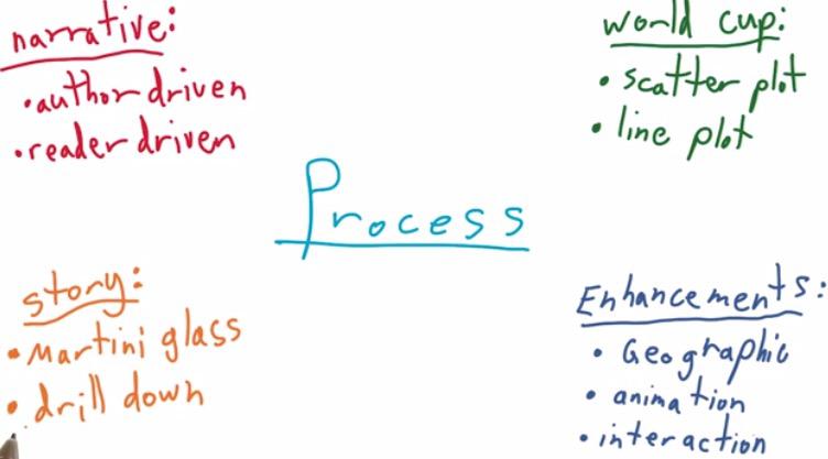
In this blog,for the chart, we can't simply use scatter plot and line plot, for author-driven and reader-driven, as it doesn't show any interaction and animation of the chart. we want to make some enhancement that include geo-map, animation,interaction, and tell it in the structure of martini glass.
Map Visualization
To create a map visualization, first we need to acquire data that related to the map itself. Typically, the data to structure a map comes with three various format, shapefile,GeoJSON, and TopoJSON. For Shapefile, the data comes with binary format, hence not readable, but it comes with smaller size format. Need a special tool to read shapefile. The shapefile also limited by its file size, so only limited number of coordinat and boundary that can be input in shapefile.
On the other hand, GeoJSON, is in JSON format. JSON format has an interface with almost any programming langguage. GeoJSON is a valid JSON format, which means that they can parse it. It also human readable, we can view and edit it in any text editor, or in the browser. But because of its advantage, the code becomes more verbose and has larger file size than shapefile, which in turn make a slower connection between client and server. The TopoJSON however,have some topography information, have extended the GeoJSON, encoded in much smaller file size than GeoJSON or even TopoJSON.
Projection
Projection however is to project our data into pixel range. If earlier date or float format can be projected into pixel value, the latitude and longitude can be projected into pixel value. D3 use mercator that project the lat long of 3d world into 2d plane world projection. This projection into 2D, which represent by lat long of 3D world position, isn't without any loss either. The mercator strecthes area along equator, which sacrifice the poles area to give a better projection for the rest of the world.
Ogre: convert spatial files to GeoJSON Shapefile-GeoJson-Github by Ben Balter
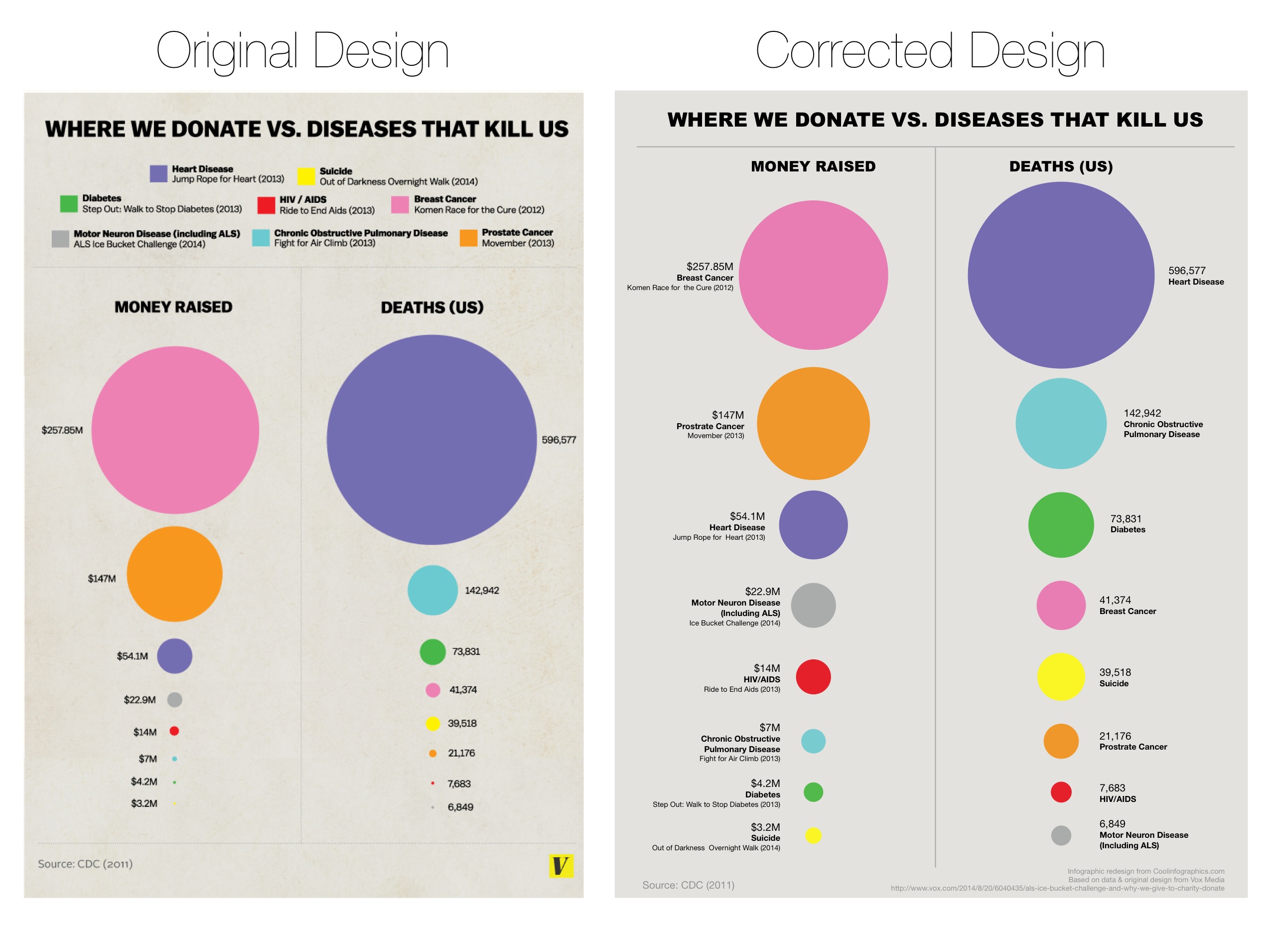
The radius for circle in the chart is not to be underestimated also. The image here is the original and corrected version of The Truth about the Ice Bucket Challenge by Vox media. You can see that you can make a mistake to give value to the radius. When you give value directly to determine the radius, the area of circle will be much larger, about two times squared the radius.
In the animation, what we need is a function that we can animate in the update function, a function on which we are keep changing the map. And the second, a way to cycle through the years. This animation, could be benefit for example the martini glass data visualization. If on the first you have a base static map of geo location, you can make animation that is author driven through the map of a glass, the reader-driven, which the readers can interact your chart.
With animation D3, we use filter() method that filter only the data that we care about, use d3 exit() to remove any elements that no longer needed to appear on the screen. And lastly, enter() to get any data that you want to appear in screen.
Matt said the data scientist's job to show in a graph an information that readers need to see. Even title, axis-label, annotation could be really help.Future Data Visualization could be world scale collaboration consist of engineers, political science, and data scientist. It doesn't necessarily true that others that doesn't comes from web background has to learn web development to master web sharing data visualization. plot.ly want to abstract those layers, and let anyone comes from various language collaborate in big data.
RESOURCES:
- https://www.udacity.com/course/viewer#!/c-ud507/l-3066258748/m-3199288543
- http://www.jeromecukier.net/blog/2012/07/16/animations-and-transitions/
- http://blog.andreaskoller.com/2014/02/d3-and-ui-animations/
- http://synthesis.sbecker.net/articles/2012/07/10/learning-d3-part-3-animation-interaction
- http://javascriptissexy.com/understand-javascripts-this-with-clarity-and-master-it/
- http://www.stator-afm.com/tutorial/d3-js-mouse-events/
- http://christopheviau.com/d3_tutorial/
- http://www.d3noob.org/2013/01/adding-tooltips-to-d3js-graph.html
- http://bost.ocks.org/mike/bubble-map/