Narrative Structures of Data Journalism
Narrative is one thing that binds all your stories. Acts as a string, binding all your findings from the beginning to the end.
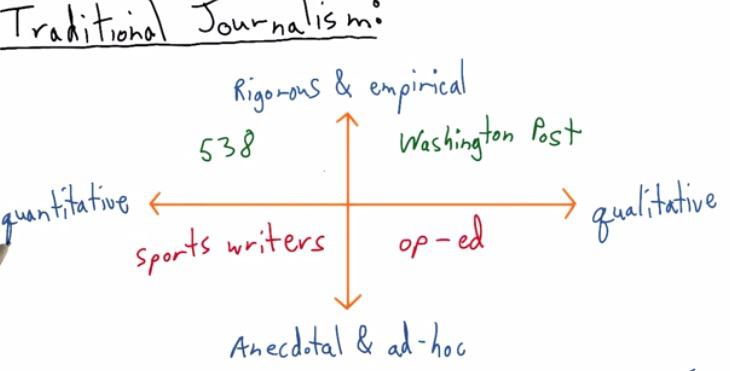
This are the quadrants shown by Nate Silver.He was known to make an article that correctly predicting all 50 states in 2012 US presidential election. For all articles he split into four quadrants. He split the article as being quantitative, which gathers all the data, or qualitative, selection of the data. Rigorous being the research that it put, or not anecdote, just put it without any backup for research.
For QII, this is where his website stands in. This quadrants is fit for data science and what we will be discussed in greater depth.On the contrary, at QI Washington Post, have some in depth research and qualitative data.
At Quadrant III we get a sports writer. Articles mostly consist of gathering all the information out there without throughful research. While the op-ed, at QI is just making an article where it doesn't back up any research.
Correlation vs Causation
Correlation vs Causation is one thing that is important in journalism. Correlation is occurs when event A occurs the same as event B occurs, in up and down. While the Causation is event A occurs because of event B.
We must not miscalculate these two. You can make inference decision based on descriptive data. There are difference between Descriptive Statistics, and Inference Statistics. Suppose there are trends that mobile device price keep getting higher. Another event occurs that generations' height will getting higher.
This could be dangerous as analyst who thinks there is causation published it in media, paper academic, or his blog. People read the article and interpret wrongly. These misleading conclusions will give serious consequences. What happen if analyst make some misleading causation. Say an expert like mobile phone production company will set the price higher and thus say the consumer their heights will getting higher (Okay this two joint events sounds ridiculous, but bear with me). It's important that we throw a great depth analysis to even makes insights.
Traditional Journalism vs Data Journalism
There are different set of methods that tradional journalism used compared with data journalism. The first one is the data. Traditionally, charts and data that has been found only add as a secondary addition, when they feel like their argument is too biased, hence add some data. The data becomes much of a elements that strengthen their stories. In newspaper, chart is surrounded by words. But in modern data journalism, it's the chart that matters. You see that often chart will comes first in the article, and some narrative to explain what is going on with the chart. The chart becomes the primary, words just there to help focus the idea.
The second is the traditional only have one allure. We just follow from section a to b and so forth. While in the data journalism, we can have various different path. Says from section A you explain it continue to section C, back to section A, maybe make some alternative links that redirect readers to some other conclusion. Various readers comes from diversity of background have some different path but the information will still be the same.
The last thing that I will point out is the media that is used. In newspaper, the chart stays static, or for some other web pages. While on the contrary, data journalism makes some interactive, chart animation. There's bunch of openweb technologies out there used to make a better visualizaiton.
Scott Murray has some good insights about misconcept in Data Visualization. Often beginners expect how to make awesome graphics. While it's maybe true, he said that 90% of the task we've been doing is to get data from various sources, clean it, make some analysis, and spits the insight. The visualization is just the final segment that you want to share your ideas.
Cole gives an example (a sarcastic articles is here) of how Fox Chart have some misleading about bar chart. The graph shows that two bar chart and our minds will make first guess that the two bar has difference ratio about five times or higher. But it does not the case. The bar is there at zoomed. The y axis actually starts at 34, and not all the way to zero. While it includes zero,the diference, at least in terms of ratio isn't that much. If we intend to zoom that, Cole advice would be to explain readers why we do that.
Data Visualization courses at Udacity makes three category of bias that we see in data visualization. It's author bias, where you as the author makes false assumption, whether mistaken for correlation vs causation we discussed earlier, or some visual encodings or elements, wrong chart like pie chart. Data bias is what we usually have.It comes from faulty measurement, human errors of input, noise, or really just an outliers. In this case you want to detect the ourliers of your data, make some analysis wheter missclasify as error or you want to put the outliers. And finally readers bias, which we will be discussed later.
In earlier we know how data visualization can be divided into data journalism or traditional journalism. This is, turns out to be the same for author-driven vs viewer-driven. Author-driven has a flat choice of story, where it has few of EDA, have a strong order, and only concern about the messaging that readers get towards the end. It focus on clarity and speed.In viewer driven however, the order, path, is relative. The viewers can take the path, choose their own ending, they can explore on their own, or even tell their own story. Sort of like having an adventure book, and you are given a choice A or B if you reach specific page. choose A will lead you to different page than if you choose B.
Viewer driven Examples
- http://sanfrancisco.crimespotting.org/#zoom=13&lon=-122.438&types=AA,Mu,Ro,SA,DP,Na,Al,Pr,Th,VT,Va,Bu,Ar&lat=37.760&hours=0-23&dtend=2015-01-02T23:59:59-07:00&dtstart=2014-12-26T23:59:59-07:00
- http://www.nytimes.com/interactive/2012/11/02/us/politics/paths-to-the-white-house.html
Author driven Examples
- http://visual.ly/visualizing-syrian-refugee-crisis?view=true
- http://www.nytimes.com/interactive/2012/05/17/business/dealbook/how-the-facebook-offering-compares.html?
There are also third method that incorporate between these two, called martini glass. Which like shape side of martini glass, you have a starting point, as you move towards the middle, it a point to a great possibility to the ends.
Martini Glass Examples
- http://drones.pitchinteractive.com/
- http://guns.periscopic.com/?year=2013
Annotations
For all the charts out there, annotations can't be simply ignored. Suppose there's a chart without all the annotations, a scatter plot for examples. We won't know what the chart it is and what it can measure. The chart can't be exist without axis label. 'Year' x-axis label in time-series chart should be clear that is just Year variables and nothing else. Or if it a measurement type, it is a measurement, if it's in a million, then we also include million in y-axis label. Even with x-axis and y-axis explanation, we don't what the chart is about until we have the title. Annotations should be effective and need no further explanations.
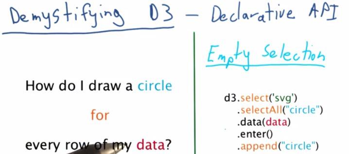
D3 may not seem obvious for most beginners, but it can be thought as a procedural programming langguage, as usual for programmers. For the questions at left side, we can write pseudocode of for loop, then append a circle based on the value of row of our data.
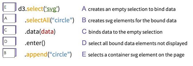
This can be true for D3, which uses a Declrative API, meaning that we don't have to specify every step like in the procedural, instead tell D3 exactly what we want. The code in d3 on the right specify that we first select d3, select All circle, this perform as Empty Selection you will be append if you have all the data. Input data that you have, in d3 loading function, enter will use data bind to the circle selection, and append the circle back to svg.
Why D3 doesn't think like procedural? Because for loop and if statement will lead to longer run time. D3 prefer to choose vectorize implementation and just let the data corresponds as a whole to svg elements. This data joins is described by its own creater Mike Bostock in this link
Data joins itself has its own definition from long ago in terms of database structure.For D3 itself it's has the same concept of data joins in database. When data() commands get called, it will mapped all the data to data it required that corresponds to the svg elements that will later be appended. append() will not map data that has no correspond to the svg elements.Enter() will input all data we need to make a chart for the first time. In the later, as long data and svg elements don't change, enter will has no data. Once it get appended, everytime this block of code run, it will not append any chart, as long the selection of svg elements, and the data itself doesn't change. This is one of advantage of D3, which act as declarative between your data and svg elements, which can be updated if any of those two change.
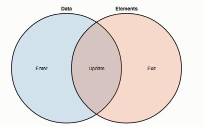
If you hadn't read the page that I recommend you earlier about data join of D3 from Mike Bostock, you should read it. Here I'm taking the diagram he has in the page. You can think this as a Venn diagram, blue circle as all the data that you have in the callback data loading function, and the red circle as the svg elements that you have in the page. Here we can see what binds the data. The intersection, the update function, will return all the the data that already bound to the svg elements. For the first time the code run, the update function will return nothing as nothings bound. But as soon as you call the enter() function, which select your data that aren't bound to svg elements, the append() will bind the svg elements with your data. That is why in the second time it's running, the update will return all data that is already bound, if data and selection of svg elements doesn't change, the enter return nothing, nothing in the data that aren't yet bound because it's already bound in the first time, except if you want those two changes for the second time.
The exit() function is the inverse of enter(), stated all the svg elements that aren't bound to the data file. We can override exit and update but it has been run explicitly alongside enter() function. Exit() is useful when you don't want to show svg elements to readers, remomve those that are no longer need to be presented in the page, or you want to perform some animation for the chart.
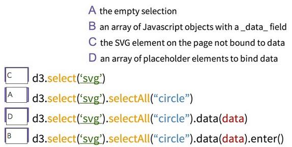
For best experience what is happening, try to step through all the process with Javascript Console. The svg will be created the element in the page. selectAll('circle') will create an empty selection, you can see it return empty array in the Console. the data will be loaded in the data file. the enter() then process, if the data hasn't at all bound to the svg elements, it will returns array of Javascript objects that contain all of the data elements. D3 will create placeholder for all the data, you will see the placeholder that enter() created has the same length of array of the data file.
For Visualization, it's possible that we make some mistake. It's fine. It is hard to find the causation of two variables. EDA is there to explore what is happening with your data, find any valuable information it, and Data Visualization will help you communicate the insights to your audience.
RESOURCES:
- https://www.udacity.com/course/viewer#!/c-ud507/l-3069149263/m-3071138952
- http://fivethirtyeight.com/features/what-the-fox-knows/
- http://bost.ocks.org/mike/join/