Design Principles of Visualization
In Visualization that you want to communicate your finding, there are two ways to choose. Expressive Visualizaton and Effective Visualization. Expressive Visualization will only shows you the data and just the data.We show the visualization and force the readers to only focus on one end, one specific end that we choose. Expressive Visualization however is how about the user interactive with our visualization, so they themselves can find the insights.Expressive communication also called author driven, and Effective Visualization called readers driven. You may want to check this article.
Earlier I write design principles of visualization in this article. This article now written in the different perspective.
Not an effective visualization can mean many things. It can mean that we make unwise choice about chart type(pie chart), wrong choice of colors, 3D, crossed arrow labels, overplotting label, and you can find many other things.
You may have to pay attention to variable size that you choose. Typically, you don't want to separate variables by using color,size,shape all at once. Your readers, I guess including you would be hard to interpret the chart.
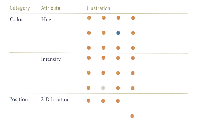
You can use preattentive attributes. It means that human can acknowledge the difference without so much thinking about it. You can use pre-attentive to lead your readers focus to whatever particular value that interest. For example, you can make all of the value by some attribute(shapes,color,angle) but choose the opposite for the particular value to make it more distinct.

Visual Attributes can be ranked by data types. For example take a look at the Mackinlay rank of data types, 1986. This could help us prioritize more about variable that are matters, we can choose the point position to the less of the focus, length, size or other retinal variables.
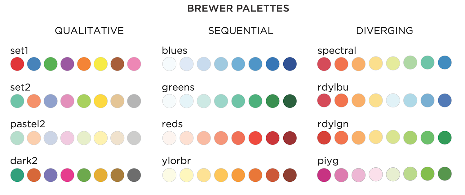
For the colors, it is much more intuitive for the readers to only differentiate two-three color. More than that, then it just lose its meaning. We can make one ordered gradient color, or two ordered gradient color.This one/two ordinal color you can find in Cyntia Brewer Article. One ordered brewer often called sequential color, while the two called divergent color. You want to keep track which color is good or bad, or more towards A than B.Maintain intuition for more than three color it's really hard to perceive. This get to means that rainbow colors are bad, really bad. You might want to never choose this chart type. Often people choose rainbow colors for quantitative data, and this means your readers going to have hard time to have the order of the color.
featurepics.com stock/
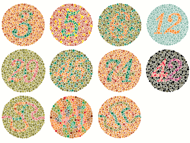
For the color you also have to concern about those who are color blind. Statistics shows that 8% male in the world are color blind, 1% for the female. Color blind means people can differentiate color perfectly in green and blue. This is bad if you include red and green. But not all red and green hue are evil to color blind. You may want to check red and green that are fit for all.Image above are a test that people can try whether they are color blind or not.
Indeed the the visual representation is the job for the graphic editor. Without adequate training of graphics visuals, scientists often put a bad chart for their visual conclusion. It's really sad how their readers could misinterpret on the work that they've been working. So as a data scientist, it's your job to think from the beginning to the end, which is best communicate your finding with the right visualization.


One thing that you may pay attention to is scale distortion. What do you notice the mistake from the graph? This is danger manipulation of the bar chart. If you look carefully, you will see that there's decrease about a quarter between 'now' and 'January 1, 2013'. There is a wide gap ratio between these two. But this is wrong. You see that the chart isn't start from zero. If this might be the case, then the ratio isn't so high. If you intend to do this, keep your readers notified about the zoom that you do. If you compare between two chart, pay attention to scale of each chart, it should be the same.Bar chart is still better for the chart. You might want to replace any pie chart that you want or you hope to make with the bar chart. But always keep in mind the danger of the bar chart itself.

Often you have seen how pretty everyone makes chart. They makes the picture in the chart, complete title sentence, and many other ways. To keep the chart relevant and clear, you want to reduce the visual representation that isn't relevant to the data. This often called Data-Ink Ratio. You want to keep your data as clear as possible. Of course you can double encoding your data with color or size, but try not to stray from the data. Below are the example image that are overink and the result after reducing it.

RESOUCES: