Statistics and Exploratory Data Analysis
Earlier in my blog, I said that Data Wrangling is not skill that statistician has. Take a lot of process to clean this data. If there's outliers, two thing comes in mind. First is if this an error in the input. If it was input by human, there's maybe human error. Or sensor error if have sensor, or network error. Second, the outliers that really mean outliers. It's just kind of noise that usually the data has. It's up to us to treat the outliers, or ignore it as we want to focus on the data.
To avoid such outliers, one way is that we can remove directly the outliers. Or we could we some CDF(Cumulative Distribution Function) to automatically remove outliers. The alternative way is plotting which you will see some historgram that show bowl-curve like.
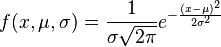
One final alternative way is to try to use the Gaussian Distribution, or called Normal Distribution. This function takes 3 things, the data itself, the mean, and the standard deviation of these numbers. Most of the data will split its distribution nicely if we just have these three things.This comes in condition that the distribution of the data follows Normal Distribution.
std_unit = (data-mean)/std_deviationWe can take standard units that take mean and standard deviation as an input, and we can predict the probability of certain number in the dataset.The resulted probability often match the exact result of the data.The best plot to visualize the normal distribution is quantile-quantile plot, or qqplot in R. This would take us to see each percentage deviation of the data. What are the data that are less than 1,2,3 percent deviation from the data. Below are the scipy function which states how many data that are less than 2 standard deviation from the mean.
import scipy.stats

scipy.stats.norm.cdf(3)
For two variable, five numbers have to be defined to summarize the distribution. Imagine that we have normal distribution consist of two variables. You can see that all data regress towards the mean. You want to make a prediction on one variable based on another variable. So here's what we should do.
correlation = (Y-mean(Y))/std_dev(Y) / (X-mean(X))/std_dev(X)This would give us the correlation of two variables. This correlation range from -1/1 to 0. approach one if approximately matched betweeen two variables, or zero otherwise. This correlation could be performed under one condition, if the 2D data projected to american football-like shape. Statistical overview alone can't described the data. You need to see how are the data distribution in visualization. Below are the famous Anscombe's quartet. You see that the top left graph perform football-shape, but not for the rest.

Always remember that this assume the data is normally distributed. You might see often that newspapers or published paper make this kind of mistake. And it's really misleading, and potentially dangerous if someone might read your article and doing research based on that.