Exploratory Data Analysis
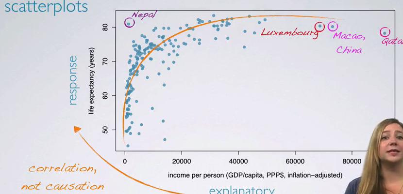
Exploratory Data Analysis is important when you want to get better understanding about your data. This data comes from GapMinder, which consist of salary and life expectancy for each year in the given country.It's clear that the data that GapMinder has is Observational Studies, and one shouldn't infer causation and only observe the correlation.
To see some correlation between these numerical value, we plot in scatter plot, and see that there's some correlation, between the explanatory, the income increase ant the life expectancy also increase.Here the circled countries are the outliers.
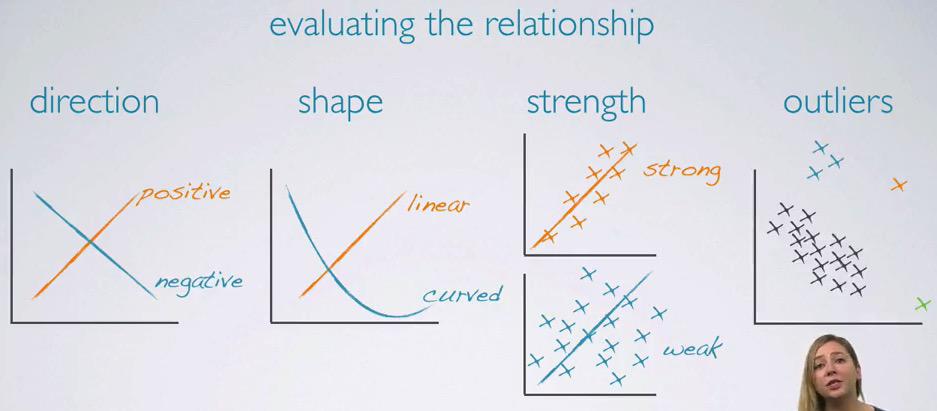
To evaluate the relationship of two numerical variables, keep in mind of the following:
- direction : Is it toward positive, or toward positive in x-axis.
- shape : Is it linear or exponential
- strength : We can draw linear line in scatter showing strong if not too diverse, or weak if too diverse
- outliers : The point in the data that doesn't follow the trend.
Outliers
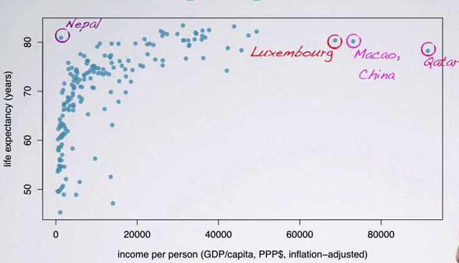
One must be very careful when dealing with outliers. One way to do this is identify the outliers. Luxembourg is small population with very wealth country, as well as Macao. Qatar is the country with oil. And Nepal considered to have high life expectancy. The other way is doing naive approach to exclude them from the data. This sometimes not a very good approach.
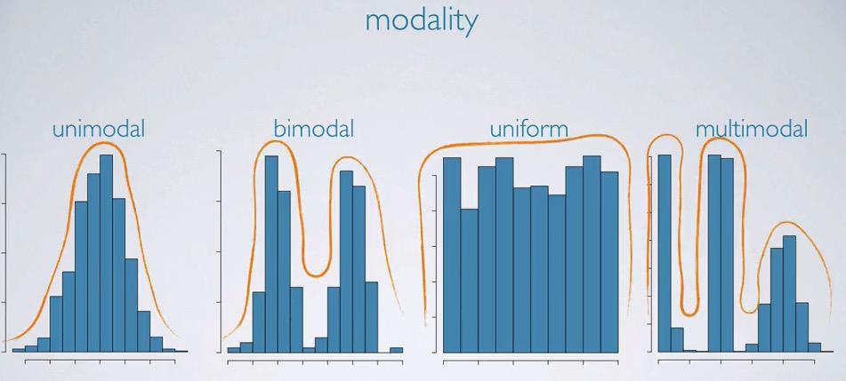
Histogram
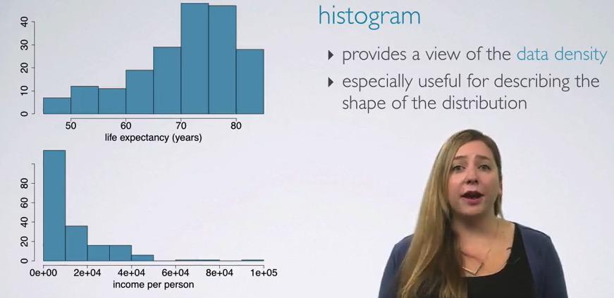
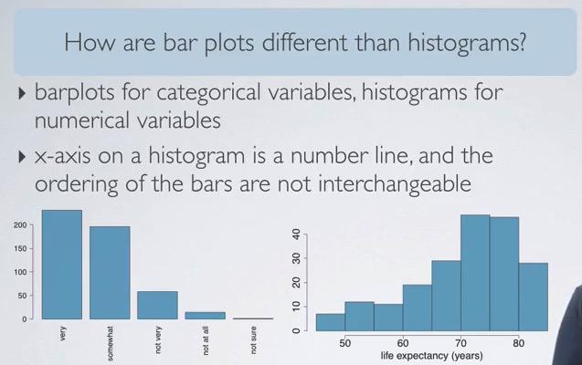
Histogram is perfectly capable when visualizing the frequency of some distribution. Life expectancy should have increase more and lot of people should have longer life. These can be seen in the upper chart that have left/negative skewed chart. On the contrary, people have low salary, mostly common , with decreasing towards the right, called Positive Skewed Histogram, These both are unimodal.Below are kinds of modality. Ones should be concern only the slope of the chart, not the jagged bin of the distribution.The diference between bar chart is that the histogram measure quantitative variable, and the histogram show quantitative variable.
If we care only the slope of the histogram ( the continuous curve), then if we're using relative percentage as the binsize, we will get exactly 1, because the cumulative sum is added to 1.
The binsize historgram could alter your insights about the information you're gonna get. Too much of a bin would not get harder insight, too width binsize you're gonna get not approximate frequency. Choosing number of bins would depends on the insights that you're looking for.
For exploratory data analysis, it often more convenient to us, to tells the binsize according to what information do we need. This is what happen, we set too small binsize for histogram.
Boxplot
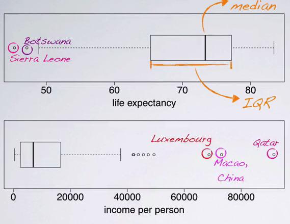
Boxplot is useful when you want to look for the median and 50% IQR of your data. Here we can also see if our distribution is skew, and identifying the outliers, as well as minimum and maximum. The disadvantage is we can't see the modality of the distribution.
Map Plot
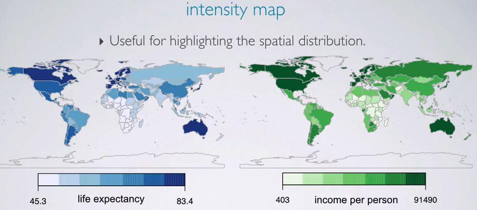
The last visualization is intensity map. Here we facet two world map, doing sequential color to describe the numerical value. This map allow us to see the distribution that we may not yet see if we use other distribution.
Table
Table can describe quickly for spesific value.
Measures of Center
Three components of Measure of Center are:
- Mean : The average value of distribution
- Median : mid value if the population is odd number, average of two mid value if the population have event number:
- Mode : The number that has highest frequency in the population.
We also doing sample statistic, represented by $\bar{x}$ for mean sample and $\mu$ for mean population.For skewed distribution, the mean always pulled towards the tail of the distribution.
Measures of Spread
MoS measure the variety of your data.MoS can be meassured in the following way:
- range: (max-min)
- variance:
- standard deviation:
- inter-quartile range:
Range(min-max)
This is relatively easy to calculate. But it's very much affected by some outliers.In presence of extreme outliers, the range would be deceiveful.
Variance
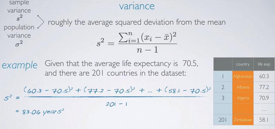
The sample can be done by summing all squared standard deviation of the data, which is squared the difference between the data and its mean, divided by the number of the data. However the result will be squared and somewhat useless, in this case $year^2$.
Squared served as two purpose, first it wouldn't cancel each other out in the data if the data have negative and positive mean. And the second is, it will magnitude the outlier.This could be beneficial, but ones still prefer same unit, which is why standard deviation alone is more common.
Counting standard deviation is easy, just square-root all of the variance.
Standard Deviation
Standard Deviation can be benefit to calculate all variability of each of the data. Just know the mean, and calculate all difference towards the mean. This takes out all complexibility if we compute all variability between each of the data. To calculate Standard Deviation:
$$\sum(Xi -\bar{x})/10$$
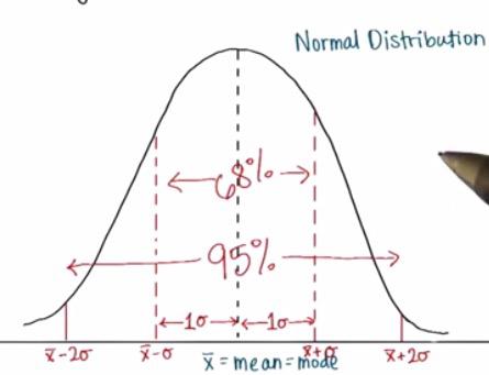
So you see, standard deviation is a single value. There's typically we can measure the spread by ranging from 1 Standard Deviation (68%), 2xStandard Deviation(95%),etc.
There's Bessel's correction that corrected the standard deviation, instead of divided by n, it will instead divided by n-1
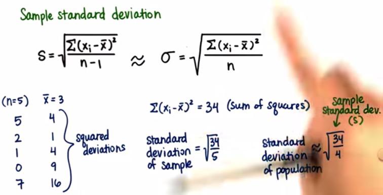
Why we divided by n-1? Because by doing that we will get larger value of standard deviation. We divided by n-1 if the dataset that we have is a sample of a larger population. Intuitively, larger population should have larger standard deviation than the sample.We only using sample standard deviation if our dataset is sample.Otherwise we're not substracting the n by 1.
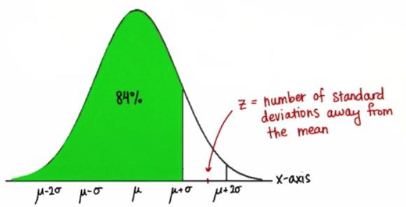
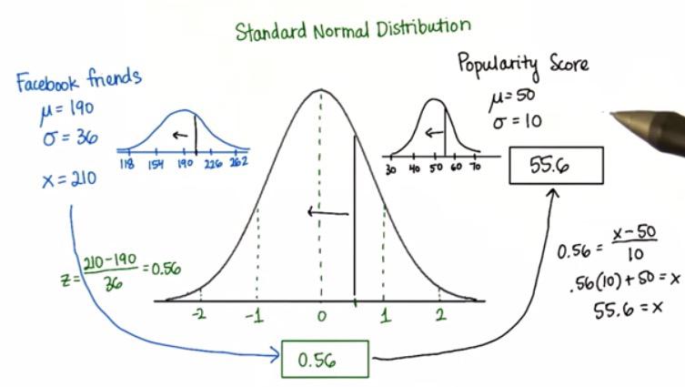
Screenshot taken from Udacity video,0:56
So here we have Z value, as the pinpoint from our distribution. Z value is used to predict estimately, how many number of standard deviations away from the mean. This is assumed that all distribution are using normal distribution. For example if we set the Z value is there, then we at least have 84% value in the data that less than a Z.
The way to get 84% is,(68 + 27/2 + 5.2) or the number standard deviations of the distance of certain value from the mean,
$$ Z = (x - \sigma) / 2 $$
In joining two normal distribution, one can use Gauss distribution, and the formula, with 0 at the center.When mentioning about the distance, no matter below or above the mean, the distance is always positive.
Even if it minus, because the value is less than a mean, then the average of standarized value deviation is zero.The standard deviation about the standarized distribution is one, because it just be that the mean is zero.
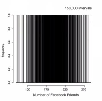
As long as we know the mean and standard deviation of the distribution, we can convert any number into any normal distribution, no matter the the variance or the height, provided with its own mean and standard deviation. Take a look at the distribution of Facebook Friends converted into distribution of Popularity Score.
Screenshot taken from Udacity video, 1:33
Variability vs. diversity
Variability gains when you have too wide gap in the distribution, while the diverse means that you have range of closer number of value.
When you're doing some statistical analysis, mean,median or mode is not the only one that's important. You also have to know the distribution your data. Relative percentage could be better to see the shape of distribution. Statistical Overview can be lying. Plotting is useful, case in point, Anacombe's statistics.
The value alone won't tell us enough information. It's by distribution, and percentage you've know value better or worse than certain threshold. 8110th ranked my not significant information. But if the rank by the distribution tells it's better than 88% of the rest population, than that's actually mean something.
Interquartile Range
Taking range from 25% percentile to the 75% percentile. IQR benefit more because it has strong reliance over the range(min-max) that often has some outliers.
What is outliers? How do we define the outliers and set the range of outliers? Outliers can be define in following way:
Outlier < Q1 - 1.5*IQR
Outlier > Q3 + 1.5*IQR
Unfortunately, IQR is not without weaknesses. IQR still won't tell us the modality of our distribution, whether it's unimodal,bimodal,uniform. For this, it's better to use standard deviation.
Robust Statistics
When talking about Robust Statisics, mean that your statistics is robust enough handling extreme outliers. For example, if you're having skewed distribution, then the median and IQR is the right way to go. If you're having normal distribution, then the mean and the SD/Range is a good way to go. In the plotting, one can use boxplot to summarize median and IQR, as well as histogram for normal distribution.
Transforming Data
Useful trick to easier build the model.
- log : skewed transform to normal in histogram. In scatter, the curve/exponential becomes linear.
- sqrt : too scattered can becomes near the linear regression.
The Goal of transformation is :
- To see the data structure differently
- To reduce the skewness of the distribution for modelling.
- To thick the scatter plot so they more regress towards the line regression.
Categorical Variables
These section divided into three of the following:
- Distribution of single categorical variable.
- Relationship between two categorical variable.
- Relationship between categorical variable and numerical variable.
Usually, we use the relative percentage of a barplot to see the distribution of a categorial variable.Here we've seen the different between histogram and bar plot.Then again, don't use pie chart.
Plotting Two Categorical Variable
Observing two categorical variable can be in Contigency Table or Stacked Bar Plot.
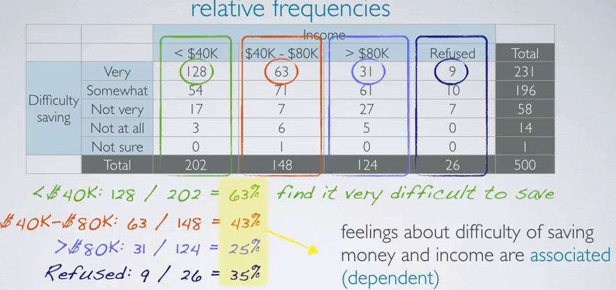
To observe the relationship for categorical variable and nominal variable, we can convert nominal into categorical variable, commonly called bucketing. We bucket these nominal variable into range bucket. Then we build something called Contingency Table as above. To make things a little easier, we calculate the only 'very' or column that denotes the stronger issue, or depending of insights you want to search.
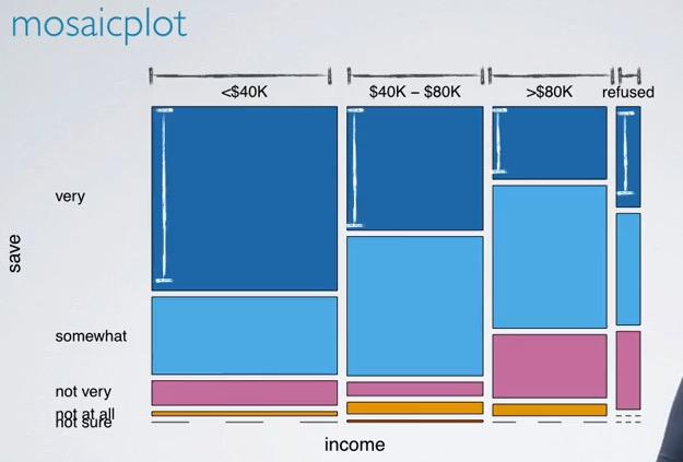
Here we also have Mosaic Plot in two columns' based on relative frequency.
Categorical Variable vs Numerical Variable
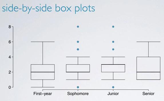
We can use boxplot to see distribution, facetting for each of the category.In boxplot we see there's T-shape for up and down. These obviously not min-max outliers values, as outliers describe by the dots, the range of T-shape is the range of outliers, which you know if you read my blog carefully :)