Introduction to Statistical Distributions
Normal Distribution
Normal Distribution will is the distribution which calculates popularity of the population. This will get discussed on including standard deviation to determine Z score of particular value.
Probability
Probability
The probability is a branch from statistics. We can rely on probabillity to predict what kind of value comes out from the population.Probability defines in mathematical formula as follow:
$$0 \leq P(A) \leq 1$$
For probability there are two popular definitions:
-
frequentist interpretation. It is the traditional method which explain the probability that observe a random process of infinite number of times, and get proportion of each of the outcomes out of all outcomes.
-
bayesian interpretation. It is the probability of two point of view observe an event. This maybe perhaps two different kind of view, a prior, which will be sometimes included in statistical inference, is a view before it's observe an event. And posterior, is the probability after observe an event. Bayesian method has been largely used in technology and methods for the last twenty years.
Intro to Inferential Statistics
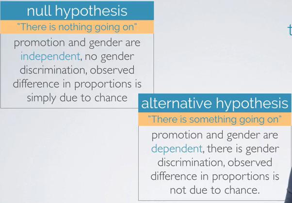
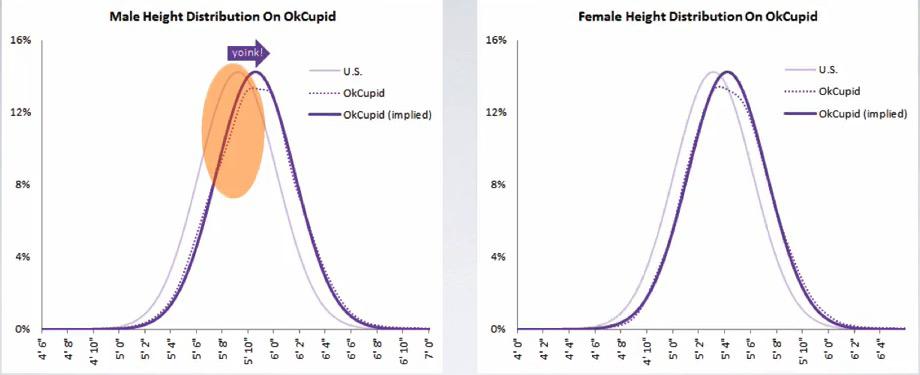
Statistics isn't only used to describe the data, to have a better undestanding. We could also infer upcoming data based on observations.This brach is callled Inferential Statistics, and of the method introduced here is Hypothesis Testing..These case are taken that given personal file to 48 supervisors, identical file, with different only in gender, there's 30% winning difference of male to female accepted to be promoted. All supervisors given random assignment which is to be expected, a controlled experiment.
Exploratory Data Analysis
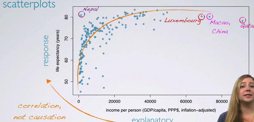
Exploratory Data Analysis is important when you want to get better understanding about your data. This data comes from GapMinder, which consist of salary and life expectancy for each year in the given country.It's clear that the data that GapMinder has is Observational Studies, and one shouldn't infer causation and only observe the correlation.
To see some correlation between these numerical value, we plot in scatter plot, and see that there's some correlation, between the explanatory, the income increase ant the life expectancy also increase.Here the circled countries are the outliers.
Design Study
Statistic is really a thing to take serious consideration. Evidence that taking from skewed sample is Anecdotal evidence, which assume only very particular cases. It is when generalizing to the mode trend of the data, we can see more generalized summary.
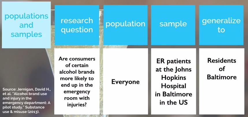
In Statistic, mostly we divide into following components:
- Research question
- Population
- Sample
- Generalize
Research Methods
As a role of Data Scientist, often we need to do a little bit of researching instead relying of our data alone. This could become a good insight as we see the data as a whole, and give a better clarification. There are many ways to conduct a research. But for a good research method, it requires us to:
- Know how many people you surveyed
- Who you surveyed
- How the survey was conducter
Visualization for Big Data
So the problem is your data is big. Really big. So big that you can't even fit the data in your visualization. There's too muuch data. And how about displaying and get insights from it. We could buy larger display to fit all visualization that we need. But data is growing so big that someday we still need another display. Let's step through what else can we do.
Design Principles of Visualization
In Visualization that you want to communicate your finding, there are two ways to choose. Expressive Visualizaton and Effective Visualization. Expressive Visualization will only shows you the data and just the data.We show the visualization and force the readers to only focus on one end, one specific end that we choose. Expressive Visualization however is how about the user interactive with our visualization, so they themselves can find the insights.Expressive communication also called author driven, and Effective Visualization called readers driven. You may want to check this article.
Visualization for Multi-Dimensional Data
If you want to take visualization for more than 3D, it's best to use retinal variables like shapes and colors. But you know that multi-dimensional data isn't just 3D, or 4D. It could be thousands or hundreds of thousands of columns in your data. All of these data have different characteristic. It's important to know that you want your data in the same page, in the same direction, same data type. This way when you're trying to visualize it, you expect to see pattern. Try to manipulate the data so they're in the same group, but not biased. You might also want to check the scales, see if all the data is in the same tuned. Data that are the same page called Homogeneity, otherwise called Heterogeneity.
Graph and Visualization
Visualization is important in data science field. One of the reason is the famous Ancombe's Quartet, where we have the same statistical overview of the data, but turns out it's a different kind of data when we are trying to visualize it. Similar thing happen when last Russian President Elections, the data that supposed to normally distributed of voters, turns out it doesn't. You can look in the internet event public trust Gauss/Normal Distribution more than its head committee.